This was my original website that is unfortunately not working
http://www.wix.com/orange_squash/evaluation#!
I made a second website below which is now the final
http://www.wix.com/orange_squash/evaluation_two
Sunday 25 March 2012
Sunday 11 March 2012
Friday 2 March 2012


Monday 20 February 2012
Final poster draft
I have sorted out the problem with the strings and added a hand at the top. The background did look a bit plain so I added some blue dots; I still need to add the poster conventions.


Final magazine design analysis
I have analysed my second draft to see is it is now following the conventions of little white lies closer.


Final magazine design

After looking at the different magazines I have created a new design which is more cohesive with the real magazine designs.
Tuesday 7 February 2012
First Magazine Draft Analysis
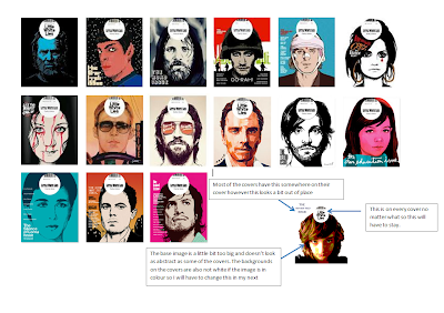
To help see what I need to change with my magazine cover I have laid out the professional covers next to mine as is seen below. From this I can now create a better cover with more conventions of Little White Lies.

Second Poster Draft
This is the basis of the idea that I had. Getting feedback from this I have found that I need to sort out the confusion people may have with the feet being connected to the strings and add the obvious poster conventions.


First Poster Draft
This is the first poster idea that I had. After creating this I had a better idea for a poster design that would create more enigma.
This original poster can be seen below.

This original poster can be seen below.

First Magazine Draft
I have created a basic design using firworks as can be seen below. Getting feedback from people I now know that I need to tweak the cover. At the moment it doesn't look quite right, it needs to follow more of the conventions of Little White Lies magazine cover and to do this I will move the image further back and create a background.


Tuesday 31 January 2012
Tuesday 24 January 2012
Rough cut feedback
I played my trailer to a group of peers I then asked them to give me some feedback on the forms I had created prior to showing the trailer. A picture of these is located below
[to be uploaded soon]. Clicking on it will bring up a bigger picture.
General points
* I found that people liked the music that I used and where I placed it; they thought that it matched the genre of my film adding pace and tension.
* Most people understood the story and wanted to find out more.
* They thought that the locations were varied and matched the genre.
* The shots I used were said to be good.
Improvements -
* Most people understood the story and wanted to find out more.
* They thought that the locations were varied and matched the genre.
* The shots I used were said to be good.
Improvements -
* People thought that I needed to change the volume of music at certain points so that the voice overs could be heard better.
* People thought that the fading of the music may be usefull so that it didn't sound so abrupt.
* A couple of people thought that I could create a better title for the film, perhaps making it fly into the shot.
* It was suggested that I could re-record some of the voice-overs so that they can be heard better, although quieting the music could work effectively.
* Titles were suggested to be added to show the actors/actresses names and to show the release date of the film.
* One person thought that the candle being blown out at the end could be extended.
Shooting schedule
These are my shooting schedule tables which show the date in which I shot specific shots. It also shows where I shot them and what the shot involves. This helped me to plan what I was going to shoot and when. Please click on each image to get a better view.


Changes to scenes
Whilst editing my trailer I have found a few scenes that either didn't fit or added no meaning to the trailer so I took them out and added a few scenes that fit a bit better. These can be seen in the trailer.
Sunday 15 January 2012
Monday 9 January 2012
Subscribe to:
Posts (Atom)